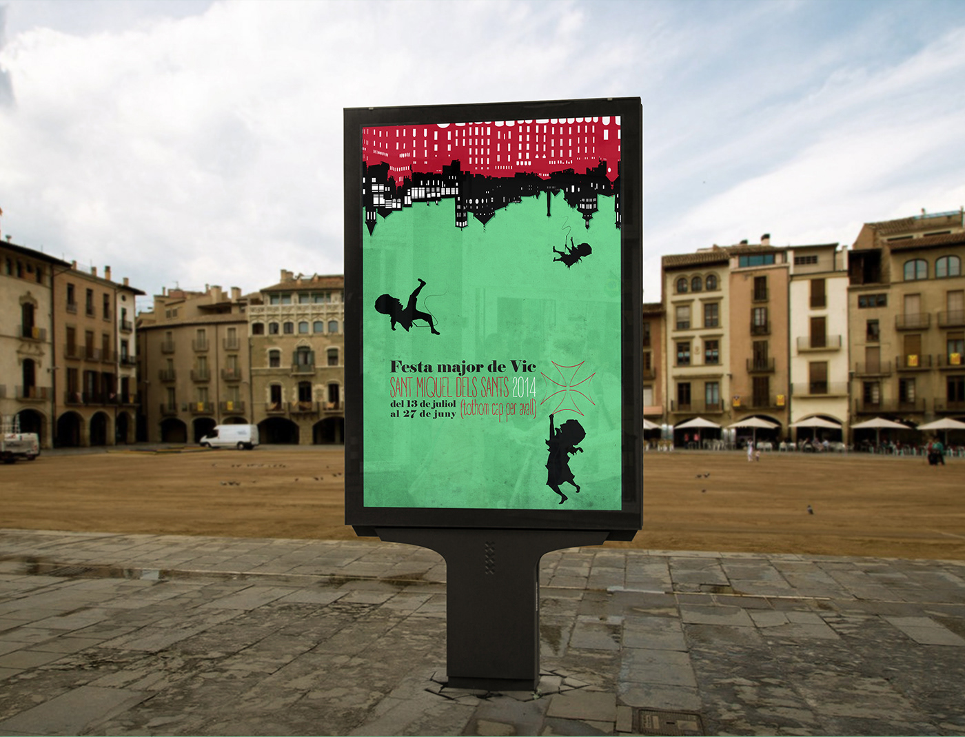
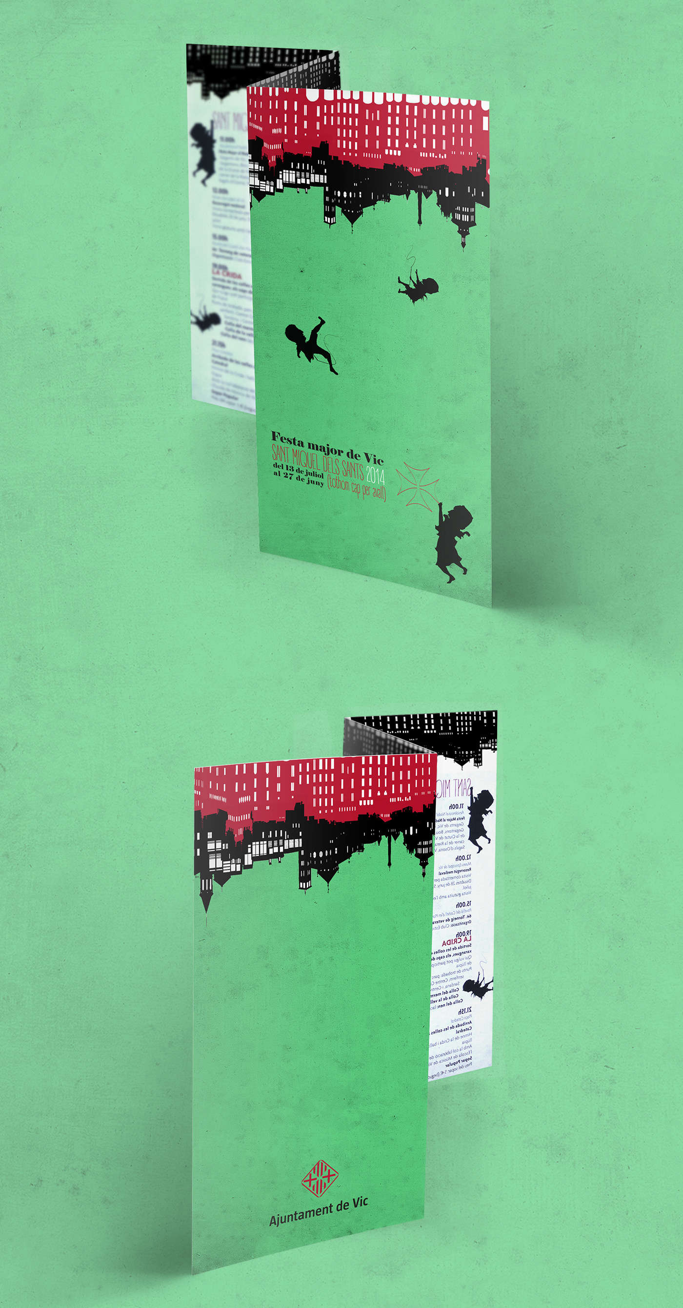
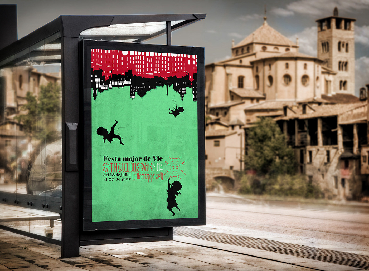
Graphic identity for the Sant Miquel dels Sants
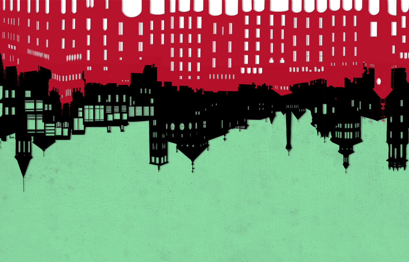
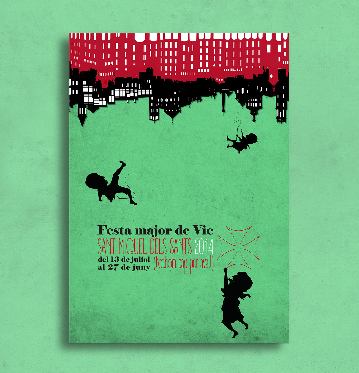
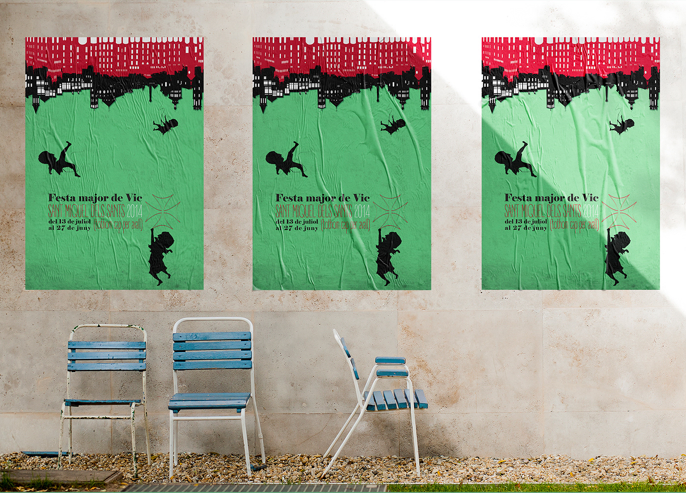
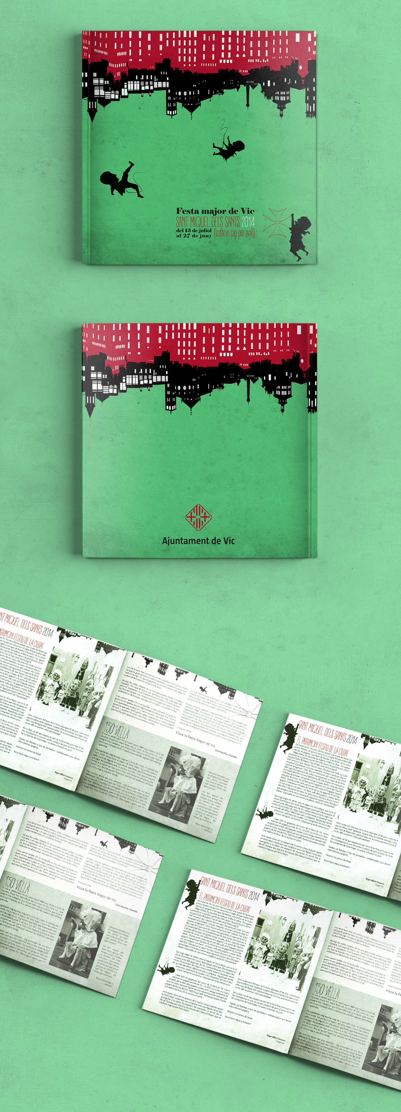
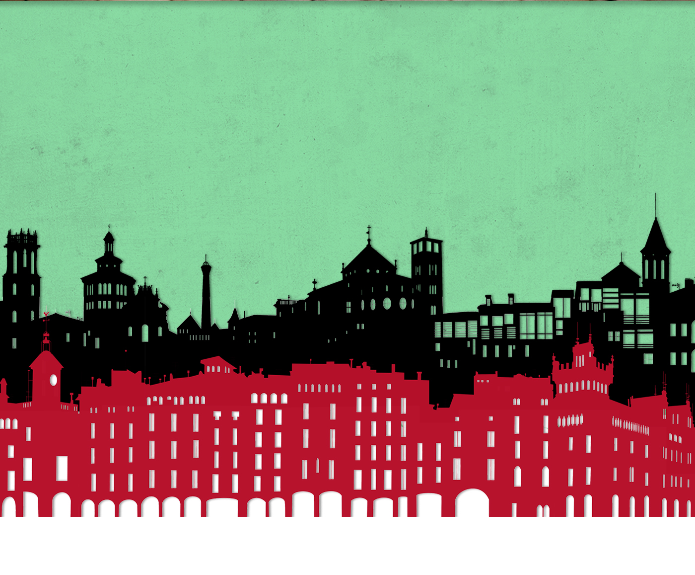
The visual proposal created for the Festes de Sant Miquel dels Sants in the city of Vic in 2014 is built around a central idea: the festive madness that turns the city upside down. During these days nothing remains static; everything moves, everything spins, and even the most ordinary elements become metaphors of joyful, collective disorder.
The design preserves the symbolic strength of the three colors representing the main colles that lead the city’s most important events, reinforcing both collective identity and the bond with local tradition. The texts and dates on the poster, also placed upside down, further emphasize this sense of a world in reverse and highlight the idea of a city living through extraordinary days, where everyday order gives way to festive expression.
This graphic identity does more than announce an event: it interprets the festival as a total experience—an universe where Vic allows itself to spin on its own axis, embracing madness as both essence and metaphor.